Definition
Anchoring is our natural tendency to rely on the first piece of information we receive. Framing is the way that information is presented. Both can influence the perception of value. You can use these principles can be used to help you clearly communicate with employees and give them all the relevant information in the most effective format to help them make the best choices for them and your company.
HR application
Let’s say it’s your company’s Open Enrollment period, you want employees to switch from their current insurance plan to a new option with richer benefits. A variety of behavioral biases (like status quo bias and choice overload) are working against you. Tapping into anchoring and framing can help overcome these tendencies.
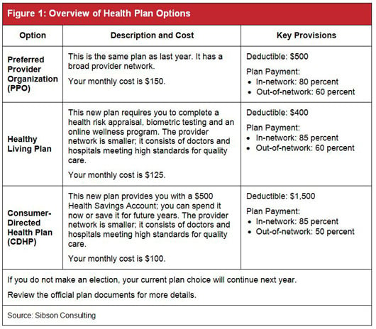
If the goal is to encourage employees to switch plans, the way you present information is extremely important. These two simple grids from Christopher Goldsmith’s article for the Society of Human Resources Management (SHRM) present nearly identical information, but one is far more effective in motivating employees to switch plans. The first grid lists plans in a random order, without any anchoring or framing employed.

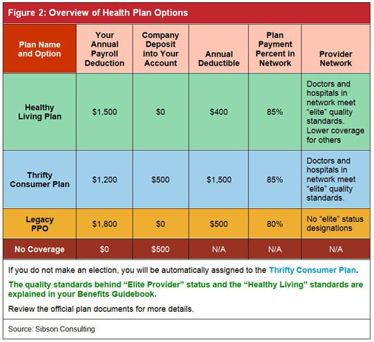
The second grid starts with the healthy living plan, which provides an anchor. Employees will naturally compare each subsequent plan to the first option.

Color-coding the rows and breaking out specific cost components into separate columns helps frame the information more clearly and simplifies comparisons. Giving each plan a plain-language name can make a change feel less intimidating.
